
Continue reading “Such Coup. Many Unconstitutional. So Thwart.”
Away From A Slant Step Theory of Postwar Sculpture
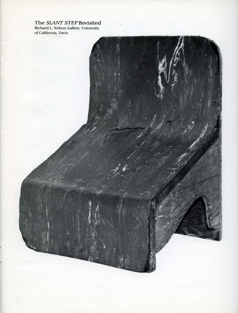
It’s been told and retold enough that even if you’ve somehow never heard it or seen its inspiration, it’s clear that several generations of artists ascribe to the Slant Step Theory of post-minimalist and conceptual sculpture: In 1965 William T. Wiley bought a plywood & linoleum stool with a steeply slanted seat at a Bay Area thrift shop. Installed in the studio of his student at UC Davis, Bruce Nauman, the Slant Step’s nonfunctional mystery and alluring form made it an aesthetic fetish object. It inspired at least two shows in the 1960s and several more since. It got passed around, stolen and rescued, surviving as an intentionally absurd teaching prompt until it entered the collection of UC Davis’s museum.
As far as I can tell, the first time it was publicly recognized as a stool for helping you squat on the toilet and take a better shit was only in 2014, well into the Squatty Potty era. Even so, it’s not clear that later shows have addressed this fundamental reinterpretation of an enigmatic totem as a highly specific, utilitarian, biological tool.
It reminds me of the novel-for-some-mundane-for-others theory of paleolithic tally sticks as lunar or menstrual calendars. And of Ursula K. Leguin’s Carrier Bag Theory of Fiction, where human experience can be understood through narratives other than violence and conflict, and motives other than competition, killing, or subjugation. The Slant Step Theory may be similarly narrow and incomplete. It’s not a mystery; it’s just you.
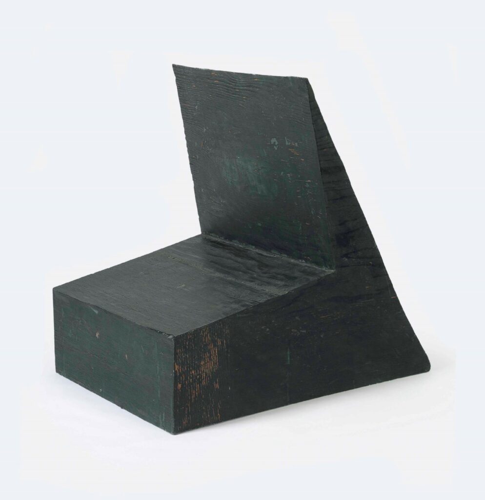
Nauman made Device to hold a box at a slight angle in 1966, with the Slant Step in his studio. It had already been shown twice before Philip Johnson’s partner David Whitney curated it into Nauman’s first show at Castelli in 1968. It went from there to documenta 4, and when it came back, Cy Twombly bought it, in 1969.
The Cy Twombly Foundation sold it in 2014. What happened to it in those 45 years? I don’t know of any photo of Twombly interiors in which Nauman’s Device appears. Did Twombly study it? Contemplate it? Respond to it? Store it away? If a revision of the Slant Step History of contemporary sculpture is in order, who knows what might be learned by tracing Twombly’s connections to and from this Nauman he kept for so long?
Sotheby’s Man & The Moon
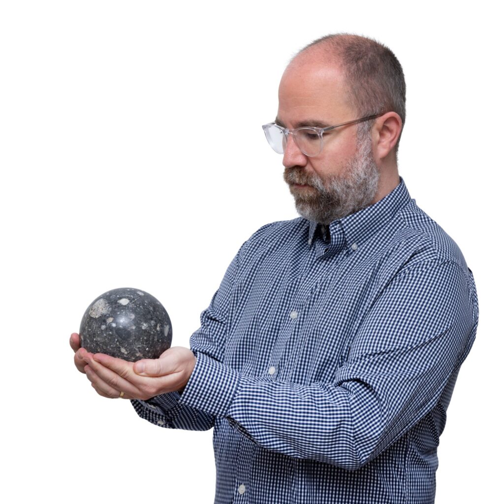
Look at it this way: if you were selling the biggest known lunar meteorite sphere in your auction, and you needed to show how much bigger it was than all the other lunar meteorites that have been ground down into spheres, would you photograph it next to a grapefruit you got at the Sotheby’s banana cart on York Avenue?
No, you absolutely would not. You would do exactly what Dr. Matthew Hoffarth is doing here, and so would I.
16 July 2025 Lot 74 | Lunar Meteorite, Tisserlitine 006, est $300-500,000 [sothebys, h/t jack]
The Caretakers of Walter De Maria at Dia
Dia has released a video about Walter de Maria and his work there. It’s specific in many interesting ways. If someone is polishing the top of Vertical Earth Kilometer in Kassel, we don’t hear about it, but there are interviews with the longtime caretakers of Dia’s permanent De Maria installations in the US: Bill Dilworth (New York Earth Room); Patti Dilworth (Broken Kilometer) and Robert Weathers (Lightning Field). Bill Dillworth died in December 2024, and the project is dedicated to his memory. [h/t Chris Nanos]
Related, somehow not previously: In 2023 Jeffrey Weiss wrote about the history, changes, and poetics of De Maria’s Earth Room after it had been removed, renovated, and remade. HVAC and new windows substantively changed the character of the work and the visitor’s sensory experience of it. But the implications extend far beyond questions of aroma, humidity, or ambient sound, toward permanence, aesthetic and the nature of the art experience.
[later that day update]: @octavio-world’s post adds new context: the Dilworths both left/retired in 2023, after the renovation/alteration, and were replaced by a rotation of minimum wage workers. So while extolling both the primacy of the physical experience of De Maria’s works, and listening to the singular people who have experienced it, that connection was broken. I mean, yay oral history, but that feels like an important thing to have omitted from the story, especially when it makes it sound like a memento mori and not a corporate/conservatorial decision.
[update: I’d had the Dilworths’ name spelled right, then I changed it after doublechecking a quote, and seeing it spelled wrong in the video captions. I’ve changed it back. Dia could do the same. Thanks for the correction.]
Art Baby, Contemporary Bathwater
There’s a lot going on in the July/August issue of The Brooklyn Rail. A bunch of people respond to Bob Nickas’ obituary/autopsy of the contemporary, which has apparently been dead art walking lo, these 25 years.
I think Rhea Anastas’ argument is useful, that the frame of the contemporary, and the art industry and auction and product trends associated with it have obscured the view of the art in our midst.
Barry X Ball is not the only one looking to the past. In arguing against a myth of progress and nowness, Jason Saager puts it simply: “the way forward is going further backwards.” Which, sure, I, too, loved the Siena show. [AND Caravaggio, though I have not seen this show]
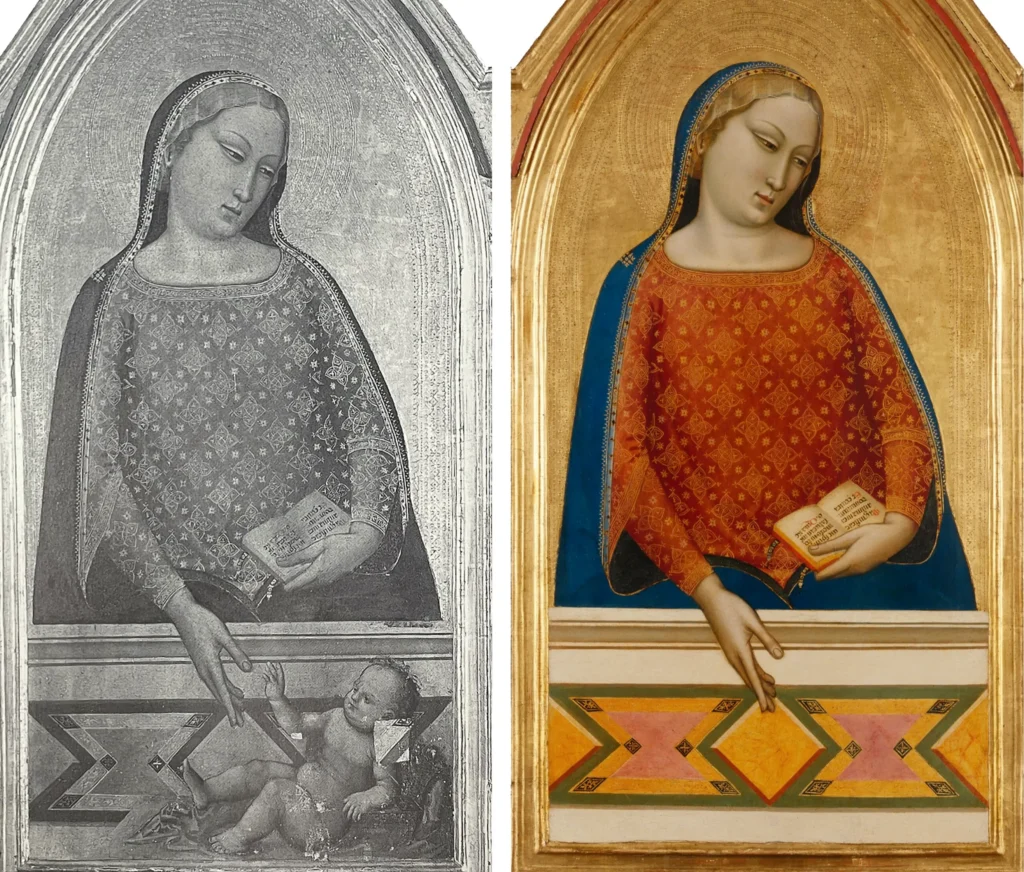
In her fascinating and sobering Irving Sandler Essay, conservator Annika Svendsen Finne looks at a controversial 1993 acquisition by the Getty of a 14th century gold ground painting of the Madonna by Bernardo Daddi, “contingent upon the removal of a large painted baby from the work’s surface, which had been added by a later artist.”
Svendsen Finne looks back across the mere decades since the baby’s erasure; at the reflections of the conservators involved; at other contemporary examples of the genre; and the interpretive advances of art historians since, and wonders if maybe the Getty should have slowed their roll, and recognized the constraints of context of their own decisions.
Look, the 21st century’s been rough on everyone, including art. It does sound like it’d be better, though, if we just step back for a minute before throwing it all out. A minute, or a generation, whichever.
Cy Twombly Watermark
At one point in my life I decided instead of just normal engraved stationery, I wanted a watermark. So I went to Mrs John L. Strong, and sat down with Mrs Lewis. Mrs John L. Strong has its own watermark, so surely they would know a paper mill that could accommodate my plan, I suggested. Mrs Lewis explained very tactfully, in as positive and genteel a way as possible, that no. Mrs Strong would certainly be able to help design a beautiful paper that evoked the subtlety of a watermark. I was glad to hear it, that we would be able to produce a paper with a watermark.
She said, “What part of ‘no’ did you not understand?” only it was the Vanderbilts’ stationer on Madison, so it came out like, “It’s interesting when two people have a conversation about the same thing, how they understand it differently.”
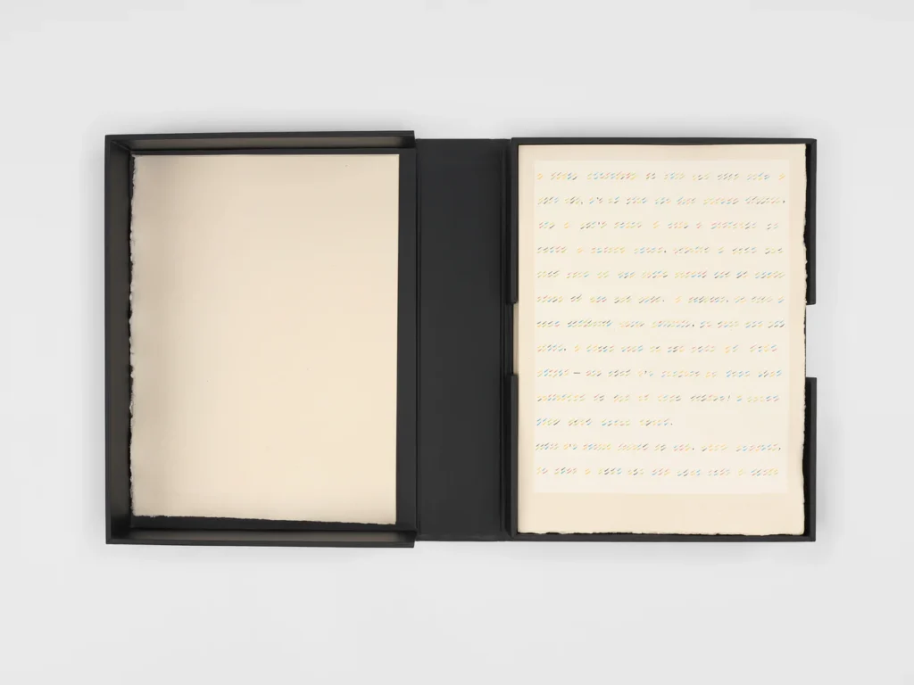
The point is, yesterday I read that in 1996, not so far from the time I was pursuing my watermark, Yvon Lambert published On Kawara’s CODES in an edition of 150 “on 180gr/m2 pure rag paper made especially for the book by the Moulin de Fleurac* and watermarked by Cy Twombly.” And I realized I’d been doing it wrong. But to know how wrong, I needed to figure out wtf is going on with why Cy Twombly is making and watermark paper for On Kawara.
He did not, and it was not. The listing for CODES in the Bibliothèques de Paris clarifies: “Chaque feuille porte la signature d’Yvon Lambert en filigrane (réalisé par Cy Twombly)” So the watermark is Lambert’s, as written by Twombly.
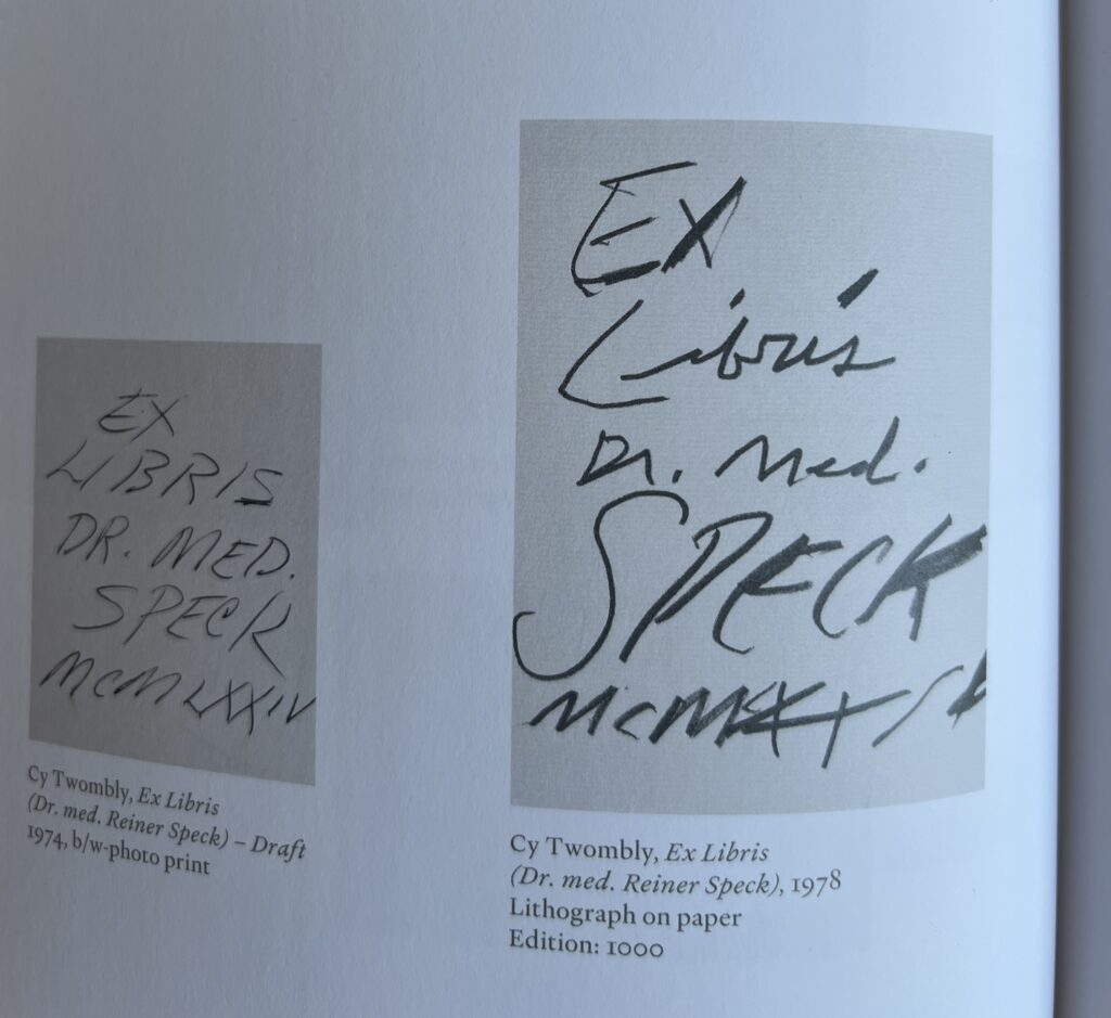
And Twombly also made his bookplate. So far I can find images of neither. But we do have two versions, four years apart, of Twombly’s ex libris for Dr. Reiner Speck, courtesy of Dr. Speck’s show of Twomblyphemera at Maison d’Art.
Do I need to check the prints CR to get a full bookplate inventory? Is a watermark a print, a drawing, or a sculpture?
*Lambert’s choice of mill for his small batch watermark paper is instructive. He did not ask Arches. Though Moulin de Fleurac sounds prized, specific, and ancient, it only started in the 1970s.
Hotdog Dog, Dawg
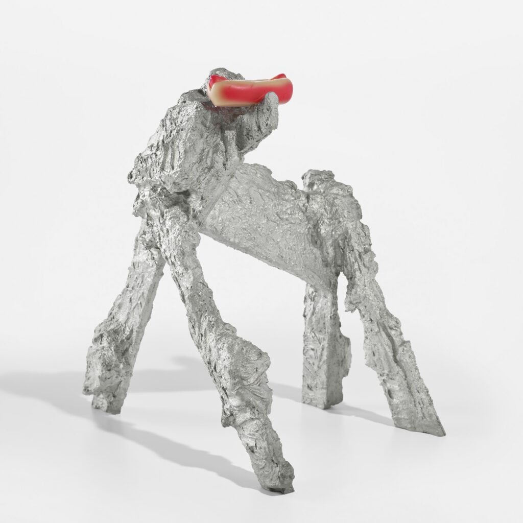
I’m reluctant to be a dog painting person, but I have no problem being a dog sculpture person. As long as it’s Rachel Harrison’s Hotdog Dog, a 2011 edition in, of all things, cast aluminum. Conservators are smiling.
There is one coming up at Kenny Schachter’s latest binge & purge auctions, this time at Sotheby’s.
17 July 2025 Lot 28 | Rachel Harrison, Hotdog Dog, 2011, est $18-25k [phillips]
On Kawara Codes, Codecs, Codex
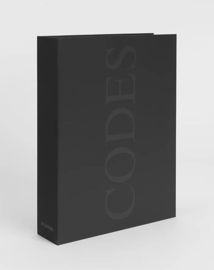
In the 2015 Guggenheim catalogue for On Kawara — Silence curator Anne Wheeler wrote that there were eight Code drawings: three made of hash marks in colored pencil; two typed texts of extremely large and small numbers; two pictograms; and a poem printed in braille.
Duncan McLaren counts nine Code works: there are actually four Code hashmark drawings, with varying titles. But then he says there are eight, because two pictograms are the same. Except the two pictograms McLaren references seem to be just two sides of one of the pictograms Wheeler mentioned, in a catalogue; the other was a poster in a window. And he notes that braille is only a mystery if you don’t know braille. Honestly, I’m taking braille and pictograms off my Code list.
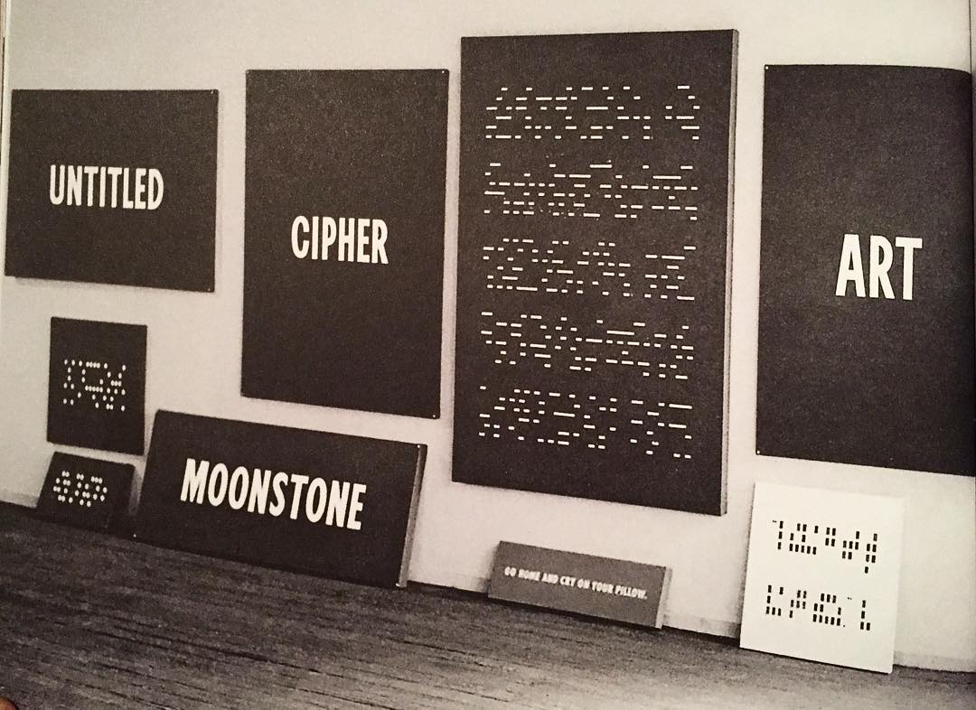
And I’m adding back the Date painting-style, graphically encoded paintings Kawara made in 1965, before starting the Date paintings, which he destroyed. The surviving Code works begin in 1965, and cluster in the 1960s. But except for a 1996 artist book, most of Kawara’s Code works were unpublished and almost entirely unconsidered until his Guggenheim retrospective in 2015. One filled sixteen pages and the cover of a massive, major 1996 catalogue, and yet seems to have gone unacknowledged. In 2015 Ben Slyngstad, a gallery guide at the Guggenheim, deciphered Kawara’s last Code drawing, Voice from Moon (2011), which turned out to be the transcript of the July 20, 1969 moon landing. Unaware of Slyngstad’s achievement, McLaren also deciphered it in 2022, and identified the source of the title and the transcript as the front page of the NY Times.
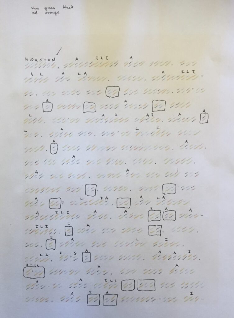
Which is all prelude to the mindboggling realization that in 2024 McLaren, Anders Delbom, and Tommy Wrede deciphered all but one of On Kawara’s surviving Code works. McLaren’s account of the deciphering extends over seven parts, and it is quite a journey, and it ends with a call for help in cracking the last Code. Which is the first, but first:
The hashmark drawings—one of which, Les Lettres d’Amour/ Love Letters (1965), was also reproduced as a seven-page screenprint in the Codes (1996) artist edition—end up being straightforward enough susbtitution ciphers, where a pair of colored hashes represents a letter from the Roman alphabet.
One drawing, Traveler’s Song, or Traveler no Uta (1965) turned out to be a partially translated Japanese folk song, with the mix of English and romanized Japanese lyrics complicating typical pattern/frequency recognition.
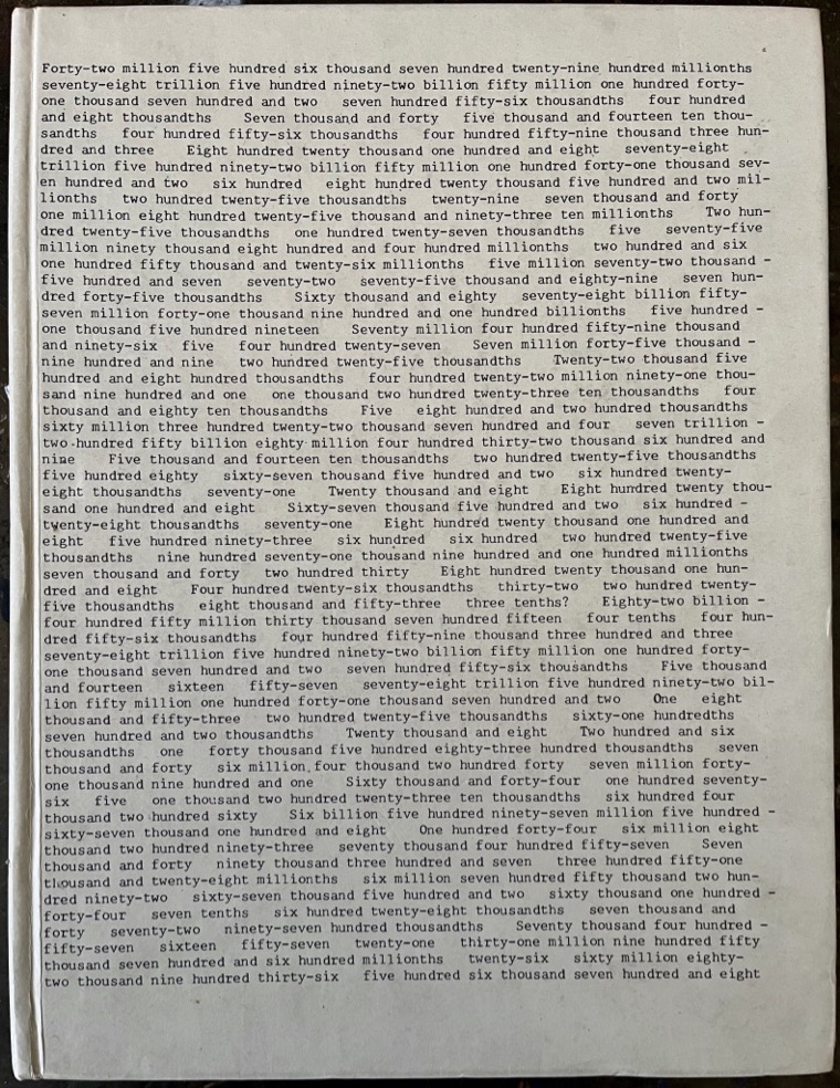
The two large number Code works, include Eight Quintillion… (1969), six pages of typed out numbers, and No Title (1996?), in which each typed out number corresponds to a sentence or line? And thus the constituent digits substitute for letters. Kawara gave a clue to the [most unlikeliest] source of the 1969 text in a rare 1970 interview. Fortunately the same cipher key was used for the sprawling 1990 text, too.
The last Code work to decode is the earliest, Code, or Colored Cryptogram (1965), in the collection of the National Museum of Modern Art Tokyo. The hashmarks appear to encode Japanese phonetic syllables. And as the surprise at what McLaren and his collab have accomplished wears off, it’s replaced by surprise that they haven’t cracked the Japanese code, too. I mean, come on, it’s been a year!
Out of The Wreckage A Masterpiece
Srsly, we cannot call it a collection. The liquidation of the art accumulated by Albright College is an epic non-event. The most compelling things are the flat files. Unfortunately you have to wait till the random-ass contents of those files are cleared out before you can bid on them. A huge chunk of the 500+ lots are the leftovers, scraps, work product, random proofs, and even the cancellation prints of one random 70s print dealer. Scrolling Pook & Pook in a visual fugue of repeats of various prints sold one at a time lulls you for the desperation of the last lots, where prints are grouped in increasingly large, but unrelated, sets. And then, finally, the flat files. Three lots, six cabinets. It would have cost Albright College a dollar to store this stuff in the corner of one fired professor’s office. But honestly, what for? In a world less on fire, it might be useful to be outraged at the collapse of this little art outpost in a place most of us hadn’t heard of before clicking, but even the ARTnews report is like, “The real problem here is not the donor wishes; it’s that Pennsylvania just has too many colleges.”
But there is one masterpiece. And it must be saved. Oh, look. It has a bid. $100. So it WILL be saved. Something is right with the world after all. Me, I will not bid on it, because I already have one.
Continue reading “Out of The Wreckage A Masterpiece”Vija Celmins Painted Surfaces
When Vija Celmins spoke to Tyler Green in 2013 about her painting Japanese Book (2007-10), she called it “an object and a painting, but with a much closer relationship than I had in the 60’s, which was obviously a painting of an object.”
Which is kind of wild because the thing that immediately registered on seeing this painting at the Met Breuer in 2019 was how clearly it was a painting of an object. Unlike Celmins’ paintings of sand, stars, or waves, Japanese Book does not fill the entire canvas. It sits in a space, with depth and shadows—like a book on a scanner bed—and with its extraordinary, textured, indigo cover. Painted.
Celmins’ works are so often paintings of photographs, which are objects in their own way, and maybe that’s what she was referring to from the 60s, when she’d paint clippings, or envelopes, alone or in stacks. Japanese Book‘s a painting of a surface, an object, so not an image. She told Tyler, in discussing Shell (2009-10), “that kind of surface that’s very, very fractured with small areas make it kind of retinally engaging and physically engaging.”
Which she would go on to paint, literally, in Vase (2017-18), also at the Met. The craquelure surface of a Korean celadon vase fills the canvas. But with the shadowy corner that seems to map the curved form of the vase, the object-painting relationship is even closer. Yet this scale of detail requires magnification; this is, again, I think, a painting of an image, if not a photo.
[a few minutes later update]: Sal Randolph shouted out The Stars, the extraordinary artist book Celmins created with Eliot Weinberger in 2005 for the MoMA Library Council. One of Celmins’ three etchings in the book is on the book: a 10 1/2 x 17 inch depiction of the entire cover of the Japanese book.
I was going to say the four-plate etching was a facsimile, but I don’t know that is the case. Also, there is a facsimile edition of the book, which is widely and affordably available. The signed limited edition of 130 went to the Library Council and various institutions, who are not big flippers. The deluxe edition, which includes an additional loose copy of one of the bound etchings, does turn up.
If it took Celmins three years to make a painting of this book cover, I think it’s safe to assume the etching was made from a photographic reproduction.
Japanese Book (the painting) is on view in the Fondation Beyeler’s Celmins retrospective through 21 Sept 2025 [fondation beyeler]
The Making Of An Artist
There are many poor choices involved here, but one straightup mistake I made was not skipping the first fifteen minutes of this video, which was so insipid it left me unable to keep watching the actual event for more than nine months. Nine months of this thing sitting in my tabs, paralyzing me like a wireless fence whenever I’d get too close or it started autoplaying.
Well, the world is in a state where listening to the experiences of George W. Bush’s three art teachers is officially a less-worse option than [gestures around] all this. And that’s what the questions, the anecdotes, the uncomfortable pauses, were all about: what was it like meeting and interacting with Bush?
Continue reading “The Making Of An Artist”Act In The Gap Between Art and Handwriting
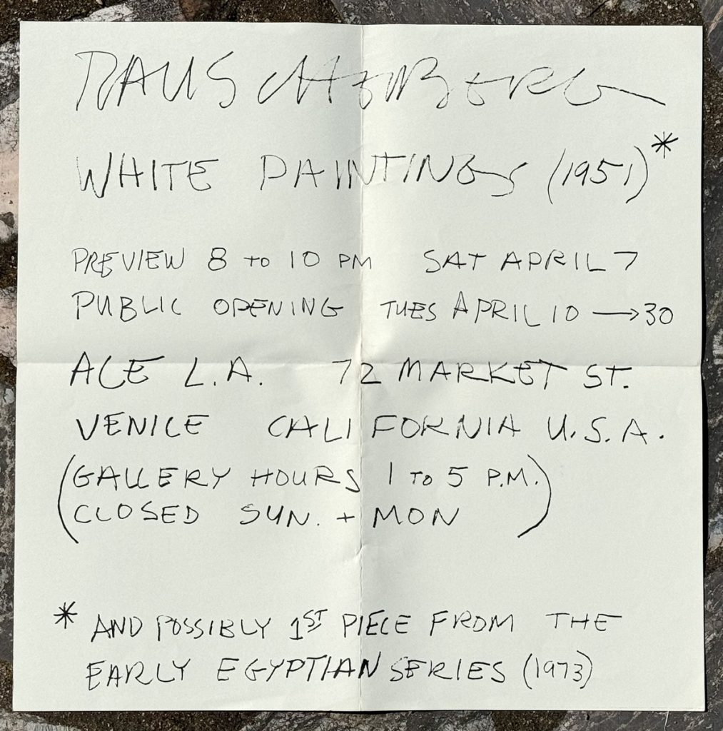
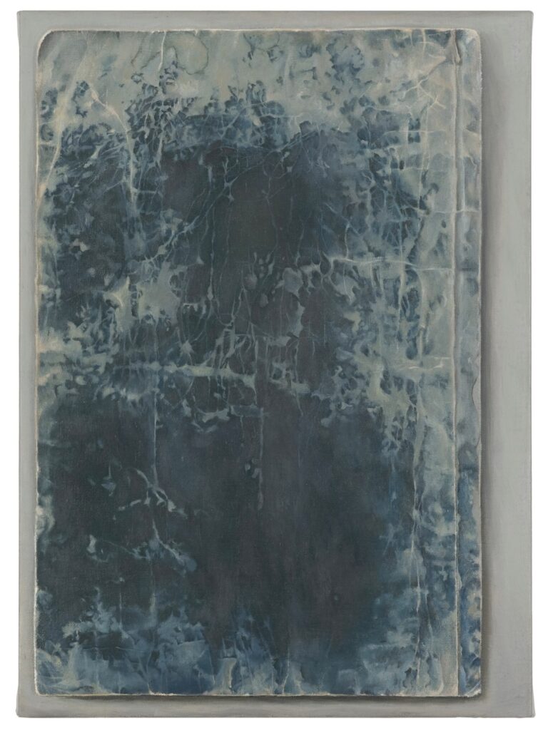
Sure Cy Twombly using photos of himself on his exhibition announcements is great, but have you ever considered the ones he wrote? In 2021 Yvon Lambert reissued Twombly’s exhibition posters, which is kind of amazing.
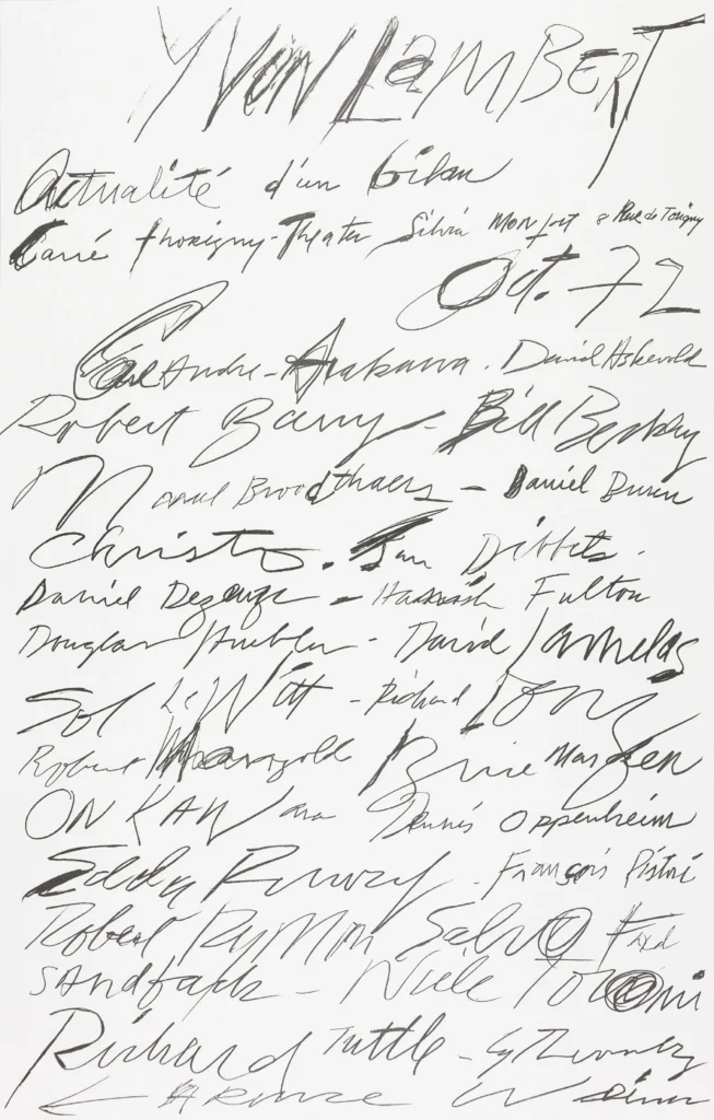
The earliest Lambert poster is for a 1972 group show, Actualité d’un bilan, which is great, but honestly, is also kind of a chaotic mess.
So when Dimitris, the ephemera dealer at Bent Priorities, says that two handwritten Rauschenberg exhibition announcements from 1973 show “similar techniques for the use of written word with his long time friend and companion Cy Twombly,” part of me wants to disagree. Because I can actually read Rauschenberg’s posters.
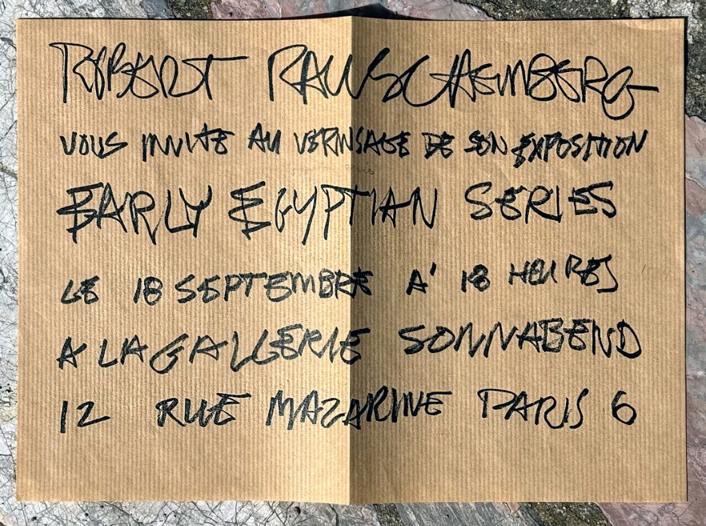
But I do think he’s right. Rauschenberg’s mountainous signature had already become a logo, but that looseness began bleeding into the announcement for a Spring show of White Paintings at Ace Gallery in LA. By the opening of his September show at Sonnabend in Paris, it had soaked all the way through.
It’s worth noting that Twombly and Rauschenberg were together a lot during this moment, mostly long winter stretches in Captiva. The next time Bob showed his Early Egyptian Series was in his two-man show—with Twombly—at Castelli. So whether Rauschenberg used some of Twombly’s techniques, or Twombly used some of Rauschenberg’s, will require closer consideration. But the announcement for that show was, of course, a photo of the two artists.
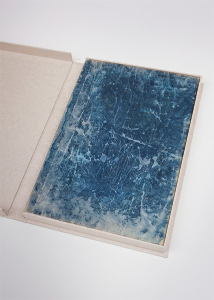
Rauschenberg White Paintings Ace Gallery show invite, 1973 [bentpriorities]
Rauschenberg Early Egyptian Series Galerie Sonnabend show poster, 1973
Screaming Is My Art
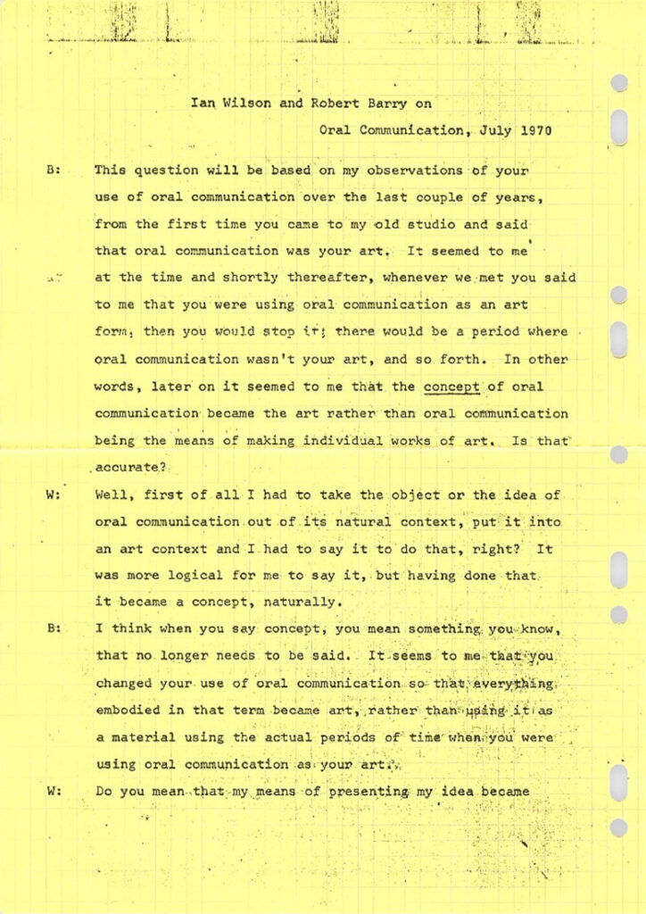
From the moment I learned of them, Ian Wilson’s Discussions were the great, mysterious apotheosis of Dematerialized Art. Memorialized in a simple statement: “On the 23rd of January 1972 there was a discussion between Herman Daled and Ian Wilson.”, yet with the essence impossibly private and inaccessible: “What was said remains in the collection of Herman Daled.”
What ever might be said in an Ian Wilson Discussion? Only a collector would know, and even he’d only know his own memory of his own piece. Line up at Art Basel and collect yours today!
So you’ll understand why I am screaming to learn, when we get a rare transcript of the damn thing, that Ian Wilson’s July 10th, 1970 Discussion as art was seven pages of him and Robert Barry discussing how “oral communication is my art.”
Ian Wilson, Discussion, 10th of July 1970 [moma via @garadinervi]
Previously, related: Hi, Bart. I am making a stained glass window!
Hi, President Lincoln. I am telegraphing from a balloon!
For Sale
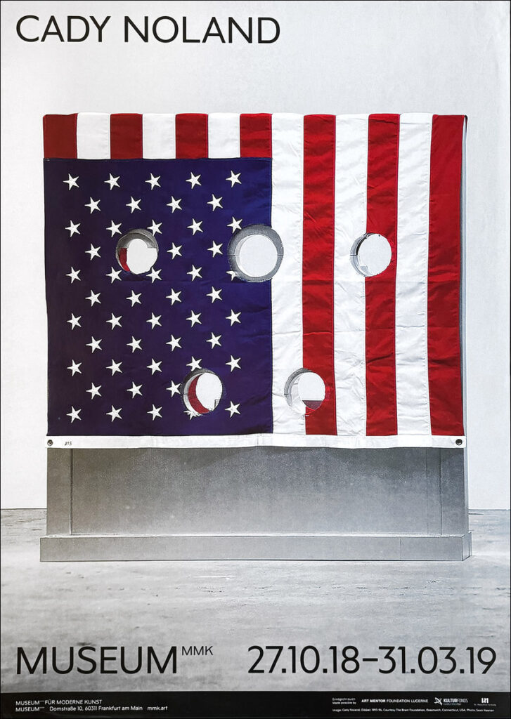
Cady Noland, MMK, 2018, €350 [bentpriorities]
OG Painted Schindler Table
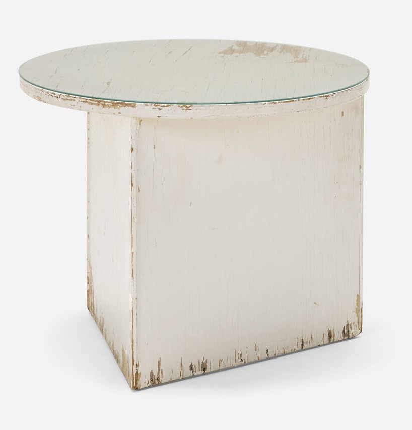
I think my respect for a piece of painted Schindler furniture is pretty well-documented at this point, but let’s be clear: this beat-to-hell 90-year-old plywood side table with flaking white paint that’s probably got enough lead in it to flip an entire congressional district Republican must be preserved at all costs.
Fortunately, the estimate of that cost does not seem high.
The table is from the Walker House (1935-56), which was the subject of an intense LA real estate fairy tale its ecstatic buyer wrote for Apartamento in 2017. But stripping the old paint off the built-ins, it seems like they prioritized their little kids’ neurological development over historic preservation, which, honestly, understandable, but which might imperil the return of this asymmetrical table to its home.
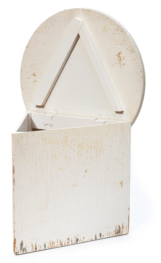
Oh, but look how it opens up! The table was the roughest of six lots of furniture the original owners’ heirs sold off in 2014, plus the archive, with not an identical finish among them. What if the paint’s from like the 70s?
17 July 2025, Lot 150: Rudolph Schindler Walker House Table, est. $2-3,000 [lamodern]
Glossolalia: Steve McQueen & HUO
I feel like I’ve been a pretty close follower of Steve McQueen’s work, but his conversation with Hans Ulrich Obrist at his show at Marian Goodman in Paris still had some surprises. [Conversation might be a strong word; there were a lot of “tell the one about” prompts that gave it an overall vibe of a recital.]
But HUO was right that I hadn’t known McQueen’s little-known 1999 project in the guest apartment at the Soane Museum, where Obrist apparently moved in for a year [!] and invited artists to come and respond to his boondoggle. It’s not mentioned in reviews of the show, and there’s little documentation. [McQueen called it Soane Sound System II, but in what earlier mentions there are, it’s listed as Soane Echo System II. Which, from the lone Getty Images PR photo, looks like it’s a mirror under a table. But there are also mentions of a DVD, so maybe there’s a Soane Echo System I, too.]
The bigger reveal, though, about 35 minutes in, where McQueen recounts a lowkey spooky experience listening to archival field recordings of glossolalia, the [usually] religious practice of speaking in tongues, while making a new soundtrack for the images on the Voyager Golden Record.
Steve McQueen’s show, Bounty, is at MGG Paris through 25 July 25 [mgg]